Duration
3 Months
Client
Jane, Harleen, Esha
Tools
Figma, Figjam, UX Metrics
Role
#
UX Design
#
UX Research

Challenge
The Morgan's website serves multiple critical functions: attracting and informing museum visitors, providing access to digital collections for researchers worldwide, facilitating online learning, and supporting the institution's fundraising and membership efforts.
However, the current site struggles to effectively serve its users, having become bloated with information over time, resulting in an information architecture that doesn't clearly prioritize user needs.
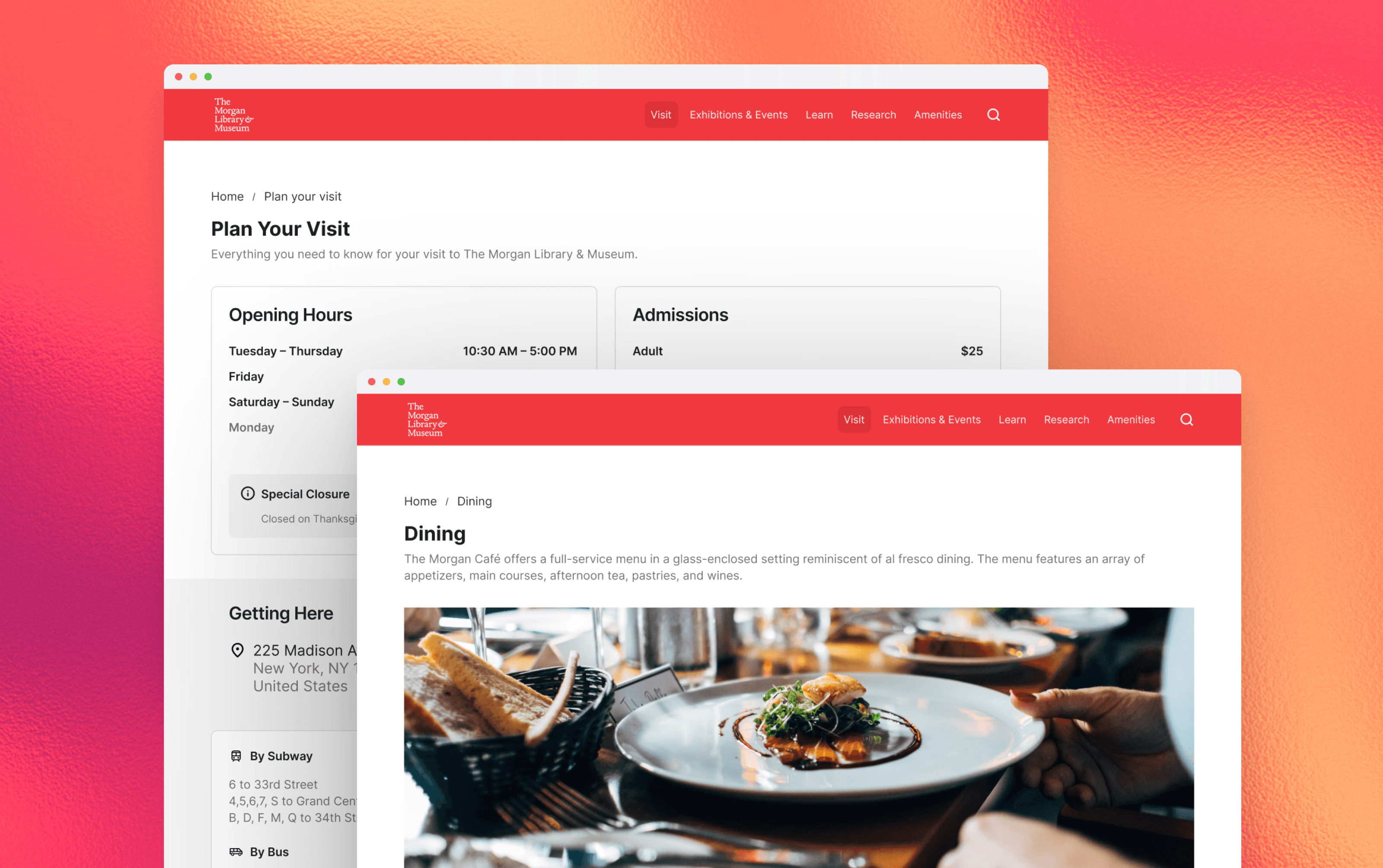

Redesigning The Morgan's Digital Experience.
We focused on the 3 flows that mattered most to our users that are responsive on both Mobile & Desktop.
Homepage & Planning
First impressions matter. We redesigned The Morgan’s homepage to clarify information hierarchy and support visit planning from the moment users land.
Important information like Plan Your Visit, Current Exhibitions, and Location & Hours are surfaced immediately, allowing users to orient themselves quickly.
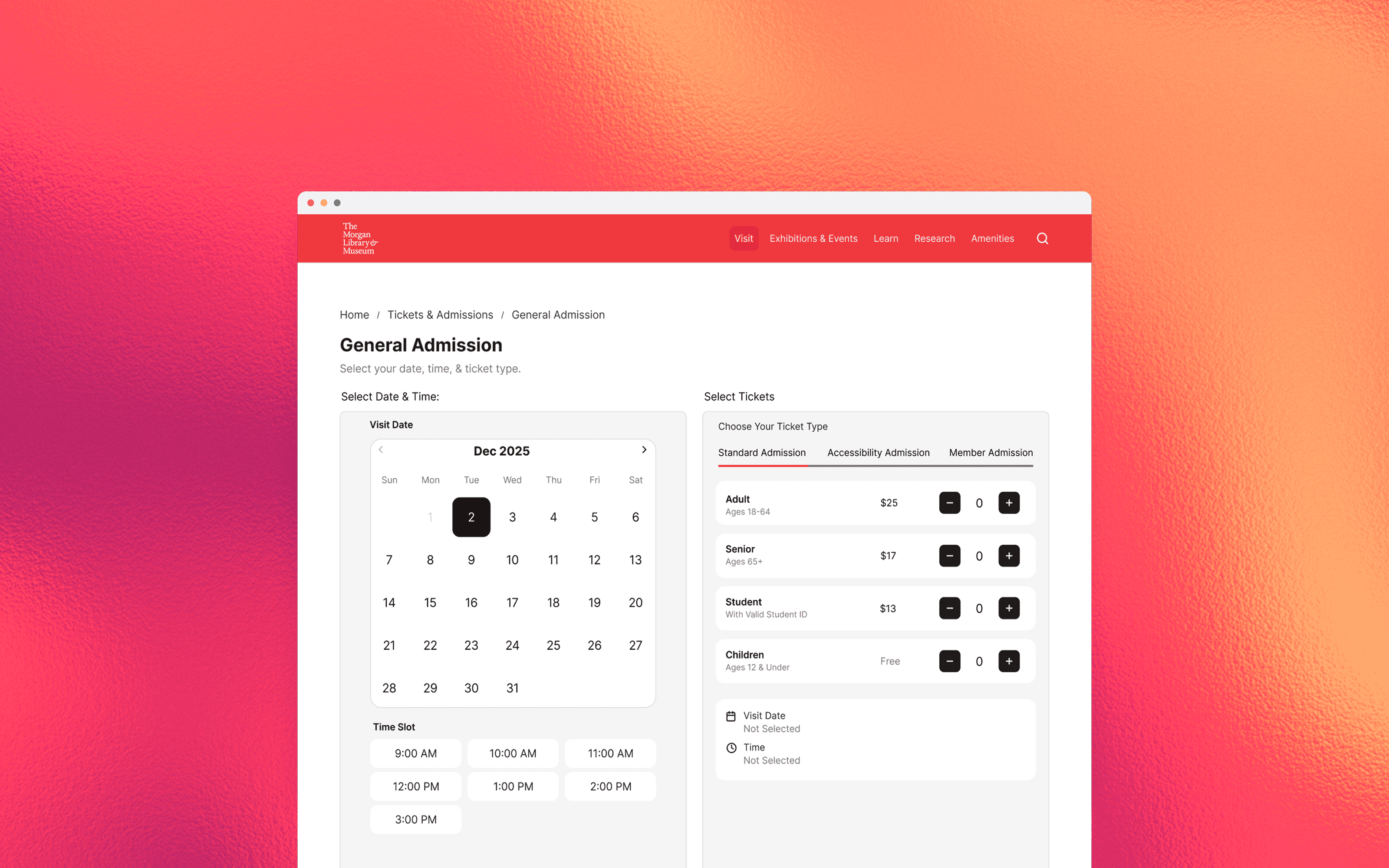
Ticket Purchasing
Redesigned for fast, confident decisions. We redesigned the Tickets & Admissions flow to help users quickly discover events through filters, search, and clear labeling, and leading them through a simplified checkout with minimal friction. Multiple Save & share options were added to support additional ticket access.
Exhibition Browsing
Recreated for effortless exploration. By consolidating all exhibition types into a single view and prioritizing concise, scannable content, the redesigned Exhibitions page reduces friction and supports efficient browsing. We also added an audio guide to these events for accessibility!
Understanding Museum Visitors
To understand how people actually plan visits & experience museums, we interviewed 6 museum-goers & did affinity diagramming to organize user insights.
Across conversations, a pattern was shown.
Visitors wanted:
Clear ticketing, exhibition, & event information
Accurate, easy-to-find museum details
Support across the entire journey! From planning a visit to reflecting afterward.
Visitors want to feel guided, not overwhelmed.

Re-organizing The Morgan's Content Chaos
To address current content overload issues & poor information architecture, we ran six card sorting sessions with new labels and seven tree tests.


What we gathered:
Goal-based navigation felt most intuitive. Users grouped labels based on actions.
Familiar terms are the way to go. Niche museum language like “Reading Room” & "Digital Fascimilies" caused confusion.
Amenities section would be useful to group things such as Cafe & Dining to better organize current site structure.
These insights became the foundation for a restructured information architecture.

What I Learned.
Collaborating with my classmates on this redesign highlighted how much stronger design decisions become when grounded in user research. Identifying pain points in the existing Morgan experience helped me understand how thoughtful information architecture can directly impact usability, clarity, and user confidence. Also, really understanding museum visitors & their typical museum behaviors/mental models helped me connect with the design problems to better tackle this challenge!